Top Fall Home Decor Ideas and Autumnal Tones & How to Implement in Your Home
Hey there and welcome as always to the T A L E S O F T E X U R E Blog….. This week we’re going to delve into the top Autumnal tones and colours. As well as the top Fall home decor ideas. The warm, grounding, cozy colours to implement this season, where they work best in our homes. And how to achieve no matter your budget. As always making those considered choices that will see us through the season and beyond…. So let’s jump straight in, cos I for one am excited and soooo ready to get all warm and snuggly!
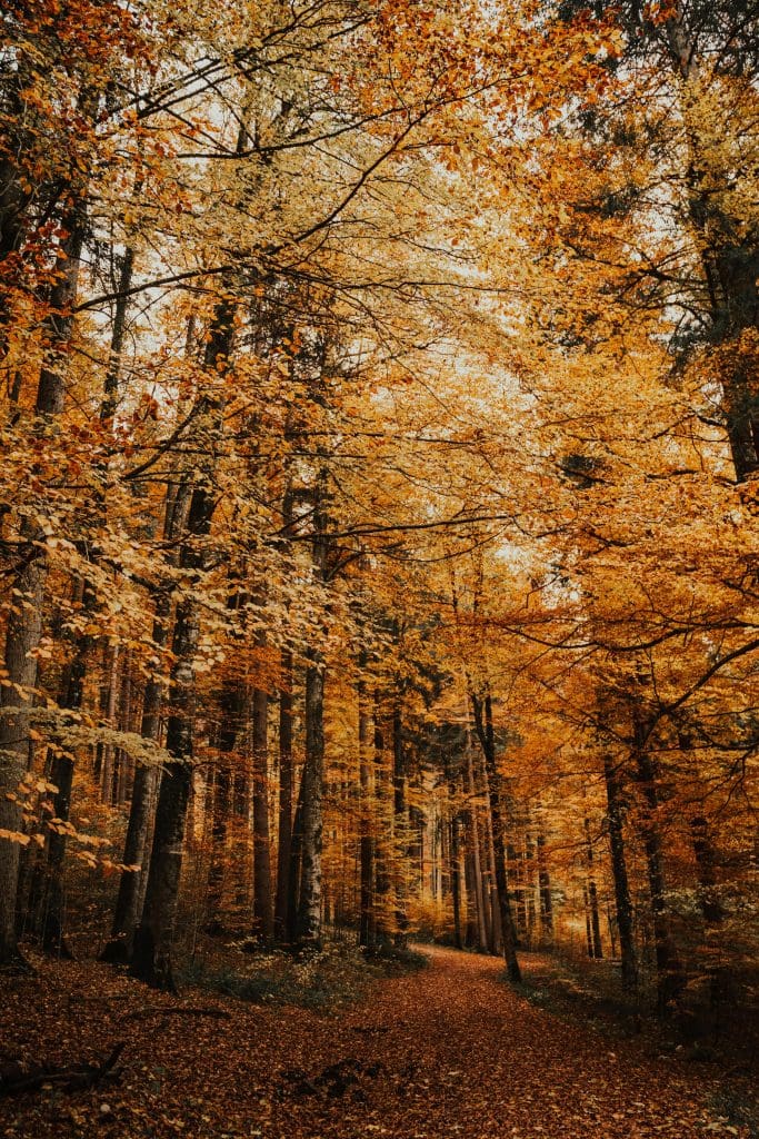
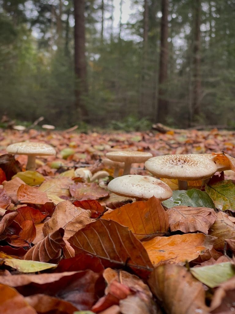
Image via Alesia Kozik / Image via Tijs de Goei both via Pexels
Top 3 Fall Home Decor Ideas and Autumnal Tones
Tone No 1: Forest Green
Introducing tones of green into our homes is no new concept. Implementing this grounding and nature-inspired colour has actually been around for a while. When our access and freedom were restricted to the outside world a few years ago, the importance and relevance of such a connection became super heightened and of major importance to us, and for good reason! The introduction of green tones within our homes evokes a sense of well-being and connection to nature. These tones are very well documented for having a calming and tranquil effect, when used correctly throughout our homes. Something that we all crave in amongst our hectic, chaotic lives!
Over the past few years, the more muted, pastel tones of the green colour spectrum have increased in popularity….. Think soft sages and light olives. However moving forward into the Autumn / Fall and Winter seasons, the Autumnal tone of Forest Green is now rightly being propelled into the spotlight and is here to stay. Thanks to its continued connection with nature, as well as its connection to Biophilic Design.
Biophilic Design is an absolute fav of ours here at the studio and is increasing in popularity greatly! The basic principle being to enhance and encourage the connection between people and nature. Many of us live in cities, or highly populated, built-up areas. Therefore have limited access to direct nature around us. However, Biophilic Design looks at increasing this connection by implementing design elements such as:
- Natural materials and organic forms: Think natural, rustic woods, bamboo, jute and sisal as well as glass, cork and natural stone. The use of organic, free-form shapes is also massive now within our interiors, replicating natural forms found in nature.
- Increased natural light and space.
- Nature-inspired colour palettes: Greens, browns, chocolates, mushroom-taupes and warm-off whites have all grown in popularity and offer the reflection of nature that is so important to us.
- Natural and living elements: Plants, greenery and foliage are so important to provide movement, life and increased oxygen into our homes.
Biophilic Design offers many benefits to our health and well-being. Including increased cognitive function, improved physical health, heightened sense of well-being, contentment and happiness, as well as increased productivity. So well and truly worth investing in for a long time to come. And I’m sure will continue to go from strength to strength in our homes.
How to Implement Forest Green into Our Homes:
The easiest and most accessible way to inject these warm and dramatic Autumnal tones is to implement plants and foliage. As previously discussed plants add life and movement into our homes. As well as depth, colour and drama (hopefully not in the looking after it and not killing it sense!!)
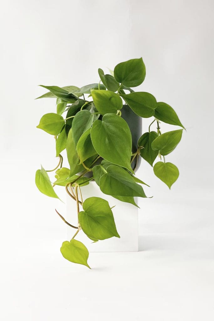
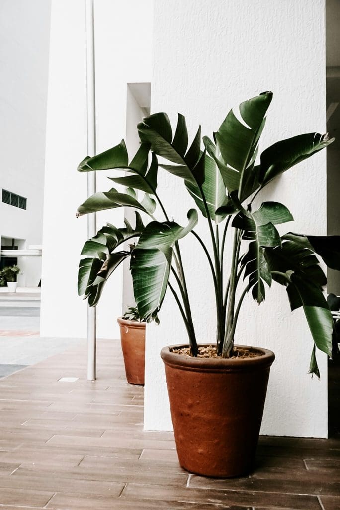
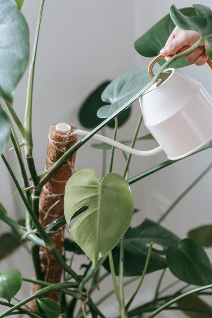
Image via H&M Home (Beards & Daisies) / Image via Julie Kuzenkov / Image via Teona Swift both via pexels
By adding a potted plant to pretty much any space within your home, you are creating a restorative and calming atmosphere. One that will increase your oxygen levels throughout your home. This will have a positive impact on your physical health, as well as your mental health and happiness. Plants and foliage can also provide a feeling of luxury and opulence….. Picture lying in a warm, steaming bubble bath with a glass of wine, candles and a beautiful big leafy plant in the corner….. Heaven!
When picking the right plants for your space consider the natural light levels and direct sunlight your space receives. You can then opt for the right kind of plant that will thrive in the environment you have to offer. Have a chat with the experts at your local garden centre. Or simply do a bit of online research into what types of plants are best for different spaces throughout your home.
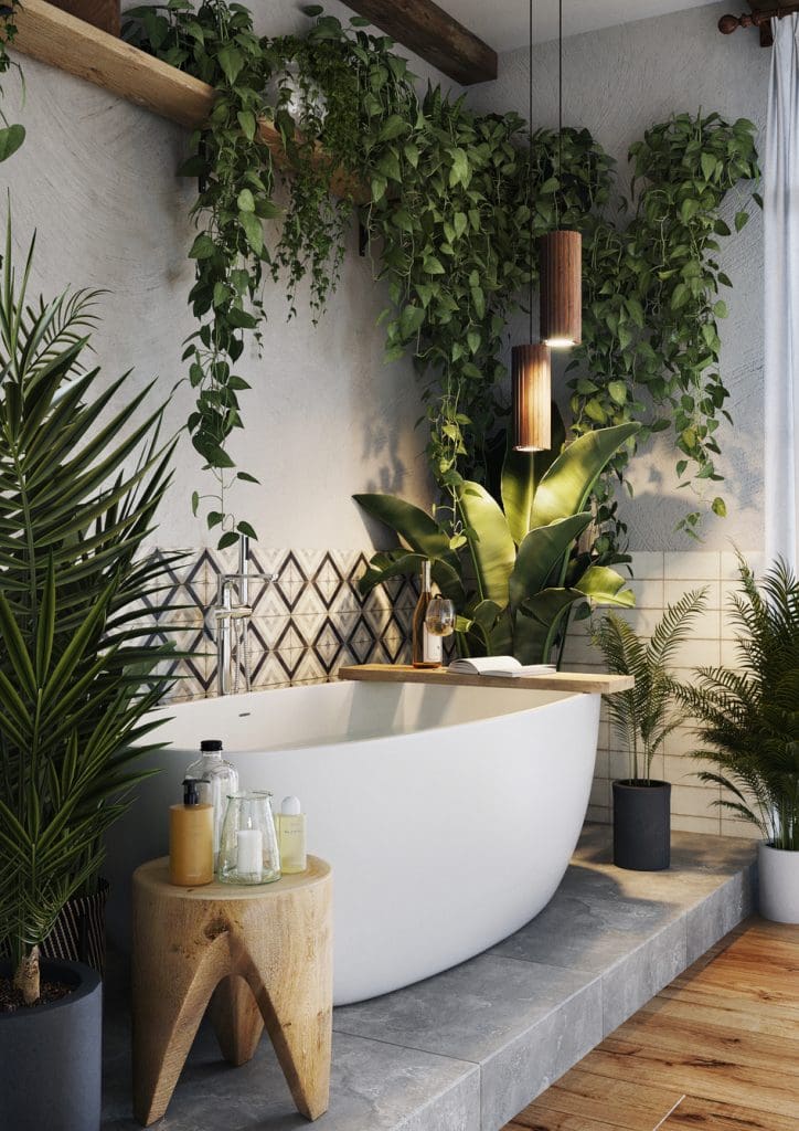
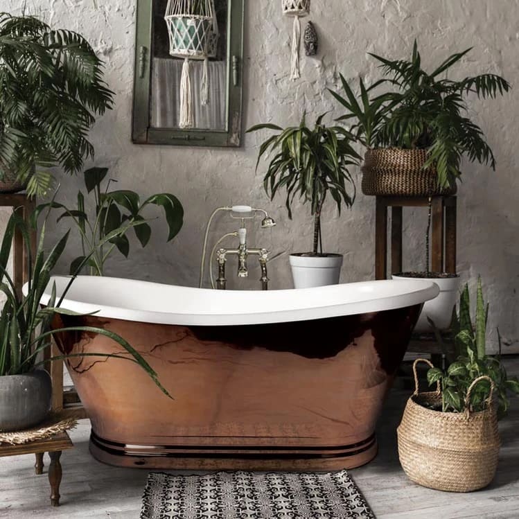
Image via Pinterest / Image via The Bathhouse
If you are someone who likes to go all in and embrace this Fall home decor idea, or is looking to completely transform a space within your home, then consider adding dark and dramatic Forest Green to your walls as well as your woodwork, trim and ceiling! If you are lucky enough to have beautiful high ceilings with cornices and ceiling roses. Painting all of these areas you will create a space that feels warm, cosy and dramatic, which highlights your detailing throughout the space. However, we can all achieve this look on some level. Whether that be in a Modern home or a Traditional one!!
If you have large windows that flood your space with natural light then you can still go for it with the Forest Green! Be brave and paint all walls as well as your skirting, trim and woodwork, leaving your ceiling a light neutral. This will still create a sense of drama and encompass the space without it feeling overpowering and too dark. Thanks to the light introduced from your large windows, and the lighter colour on the ceiling drawing your eye up. This method works particularly well in bedrooms as well as living areas and at-home office / study spaces.
However, if you really want to achieve this look but on a smaller scale. Pick a more bijou space within your home, or one that has limited natural light, such as downstairs washrooms, on-suite bathrooms or mud rooms. Here you can play on the fact that the space receives little natural daylight. And amp up the feeling of drama and depth.
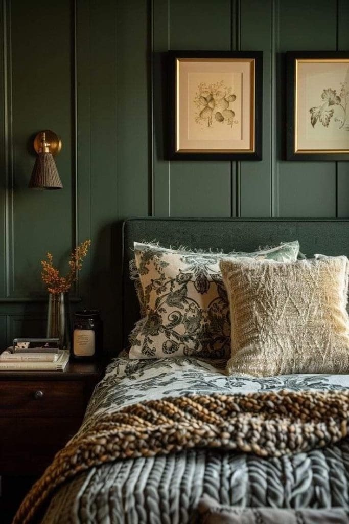
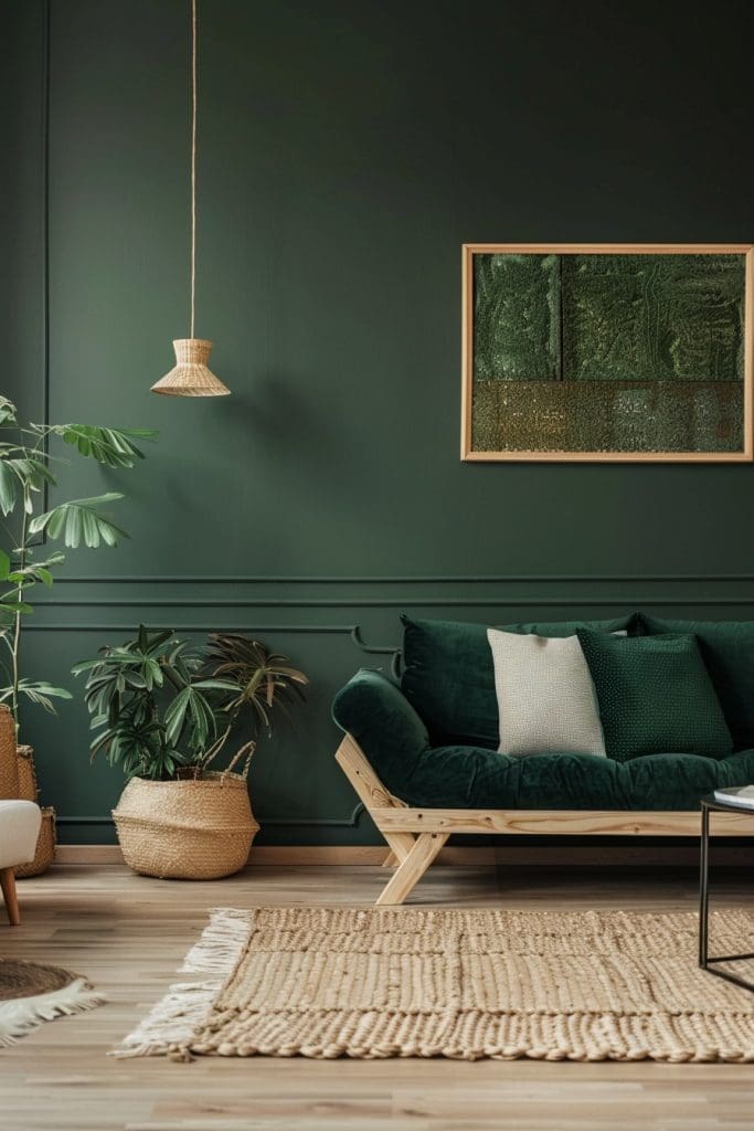
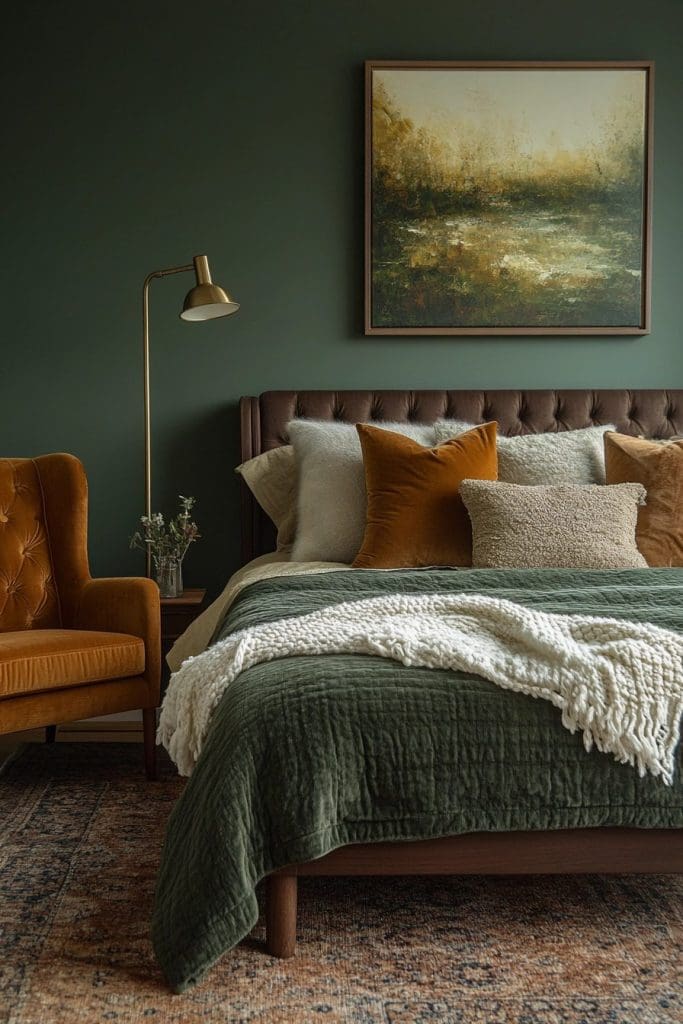
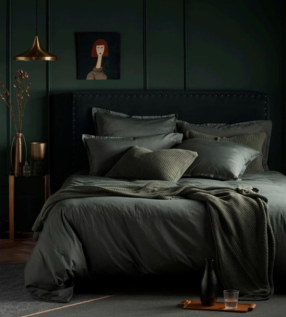
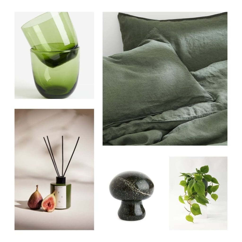
Image via Pinterest / Image via Home Campanion Magazine / Image via Courtneys World / Image via Secret Linen Store
If the idea of painting the whole room is a little too scary then no problem, simply introduce it on a feature wall or two! This still provides the gorgeous colour depth and drama this tone provides but doesn’t overpower. Forest Green pairs particularly well with soft, light dusky pinks. As well as warmer earthy tones of rusty oranges and muted mustards. But if ‘Dopamine Decor’ isn’t your thing (Simply meaning a space that is saturated with colours that evoke feelings of happiness, delight and joy) then it also pairs beautifully with warm off-whites, mushroomy-taupes and warm grey and beige neutrals. So no matter your tastes you really can implement Forest Green throughout your home. Balance this with your already existing colour palette and the chosen sense and feeling you want your home to provide.

Image via Coat Paints
Forest Green Fall Home Decor Ideas and Where to Shop:
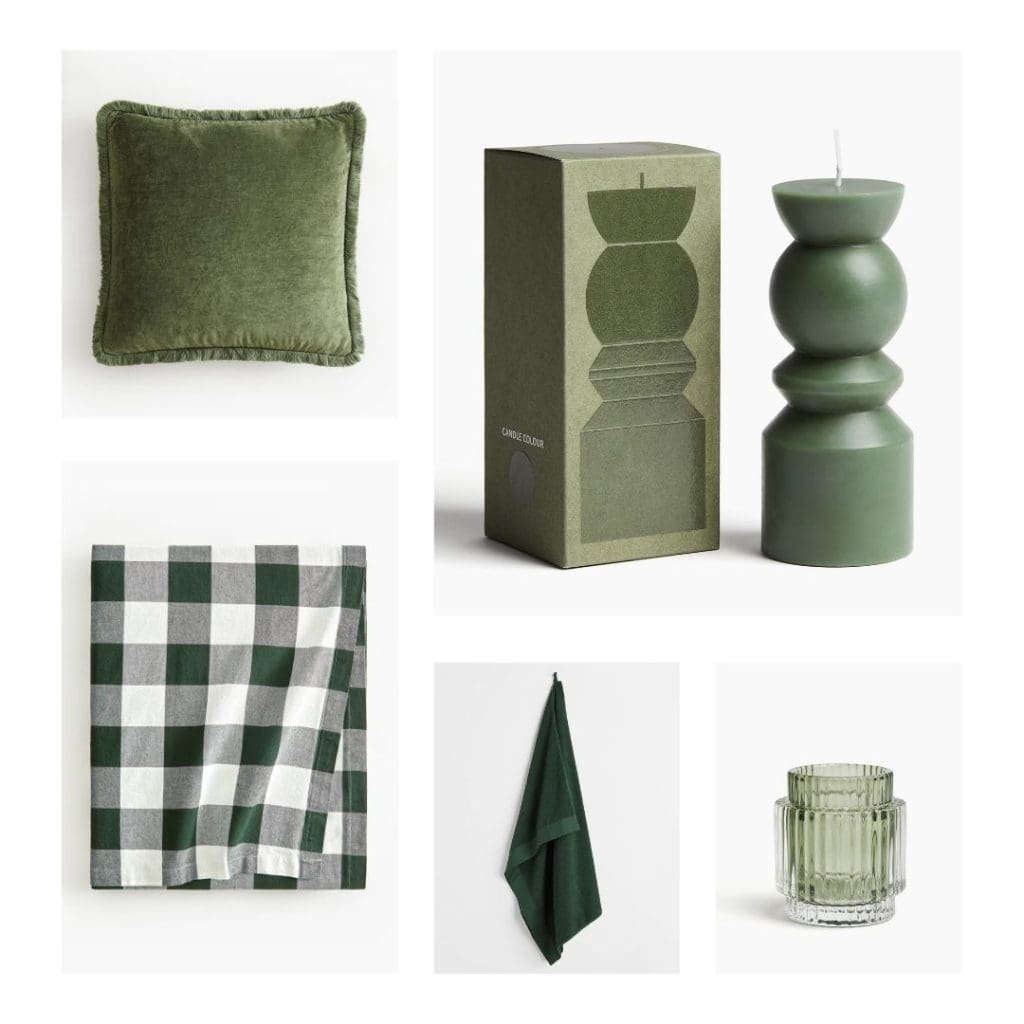
If you’re looking for simple ways to inject Forest Green throughout your home then consider updating just a few key pieces of furniture. Or swap out some decor pieces for the Autumn / Fall season ahead.
Pretty much every high street brand and store has Forest Green decor pieces and furniture available right now. When paired with existing pieces within your home they give a little Autumn refresh without costing the earth! So let’s delve into some of our fav pieces here at the T A L E S O F T E X T U R E Studio…..
H&M Home:
https://www2.hm.com/en_gb/home/shop-by-product/view-all.html?colorWithNames=green_008000
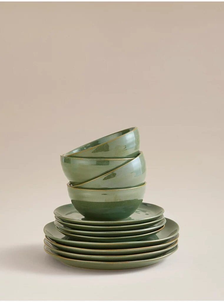
Forest Green is a staple green hue for H&M Home. It makes an appearance every Autumn / Winter season thanks to its connection with a classic Christmas colour palette. They have so many choices of decor pieces, linens, and tableware within this dark and moody tone. With prices starting from as little as £2.99. This year they are pairing it with warm off-whites and caramels for a modern take. However, Forest Green accents work well with a wide spectrum of neutrals as well as natural textures and materials such as rattan, jute, natural marble and stone, and slate. So inject your home with rustic charm, natural textures and materials, and the added depth of colour and warmth that Forest Green provides.
George @Asda Home:
https://direct.asda.com/george/home/D26,default,sc.html
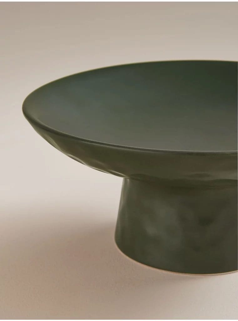
Why not pick up a few little decor pieces whilst doing your weekly shop?! Asda has a great selection of Forest Green decor pieces with incredibly competitive prices that won’t break the bank. The green dimple pedestal bowl will see you through Autumn and Winter. Styled with pinecones and fairy lights. Then for lighter Spring / Summer months simply replace with fresh limes or apples for a beautiful seasonal table display. Quick, simple and incredibly effective!
Forest Green Furniture:
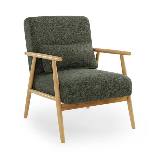
Images via Dunelm
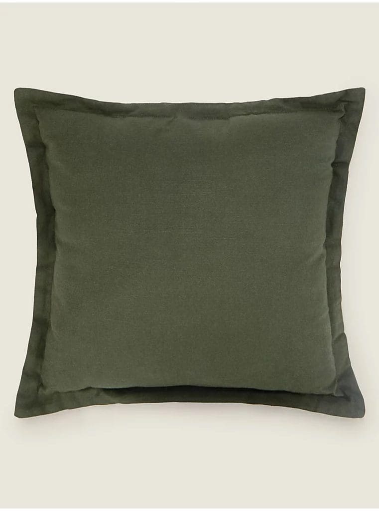
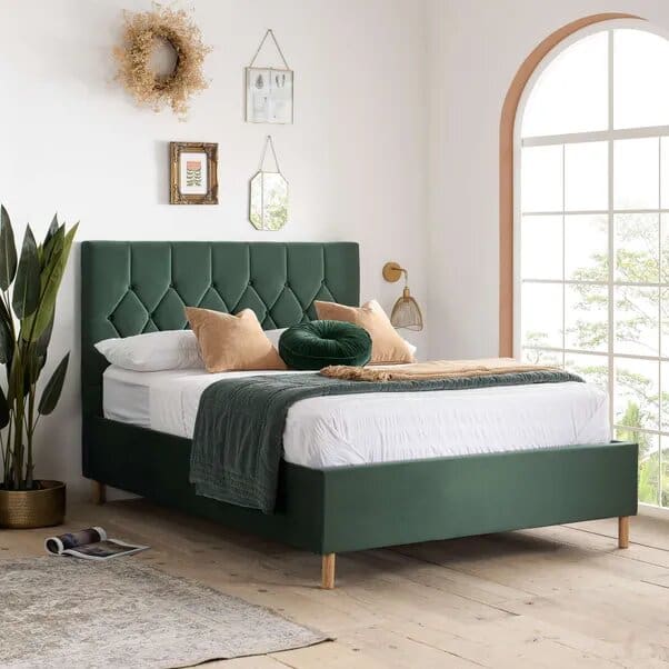
Furniture pieces that lend themselves well to Forest Green include sofas, snuggle seats, dining chairs, bed frames and ottomans. Basically any kind of upholstered furniture! The darker, sumptuous tones work well in linen and velvet as well as chenille and faux fur. All perfect for a cosy and opulent finish with added drama for those darker months. Take a look at John Lewis, Habitat, Dunelm, DFS and Dusk….. All of these brands and stockists offer great quality, modern and traditional pieces in varying shades of Forest Green. So you’ll be sure to find something you like and that suits your home aesthetic.
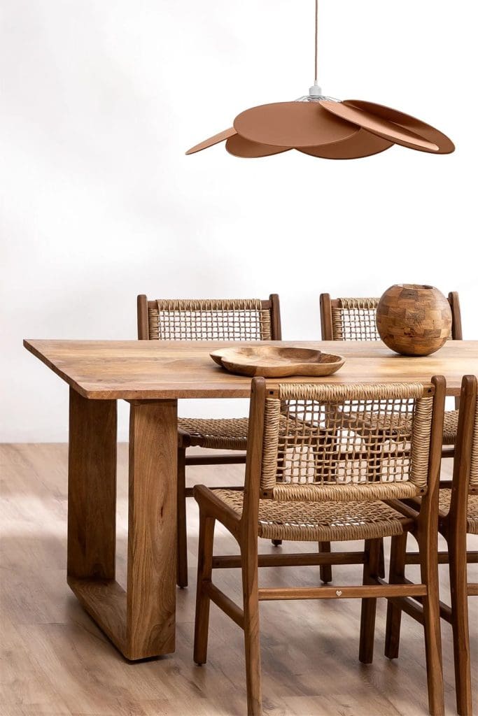
Forest green lighting:
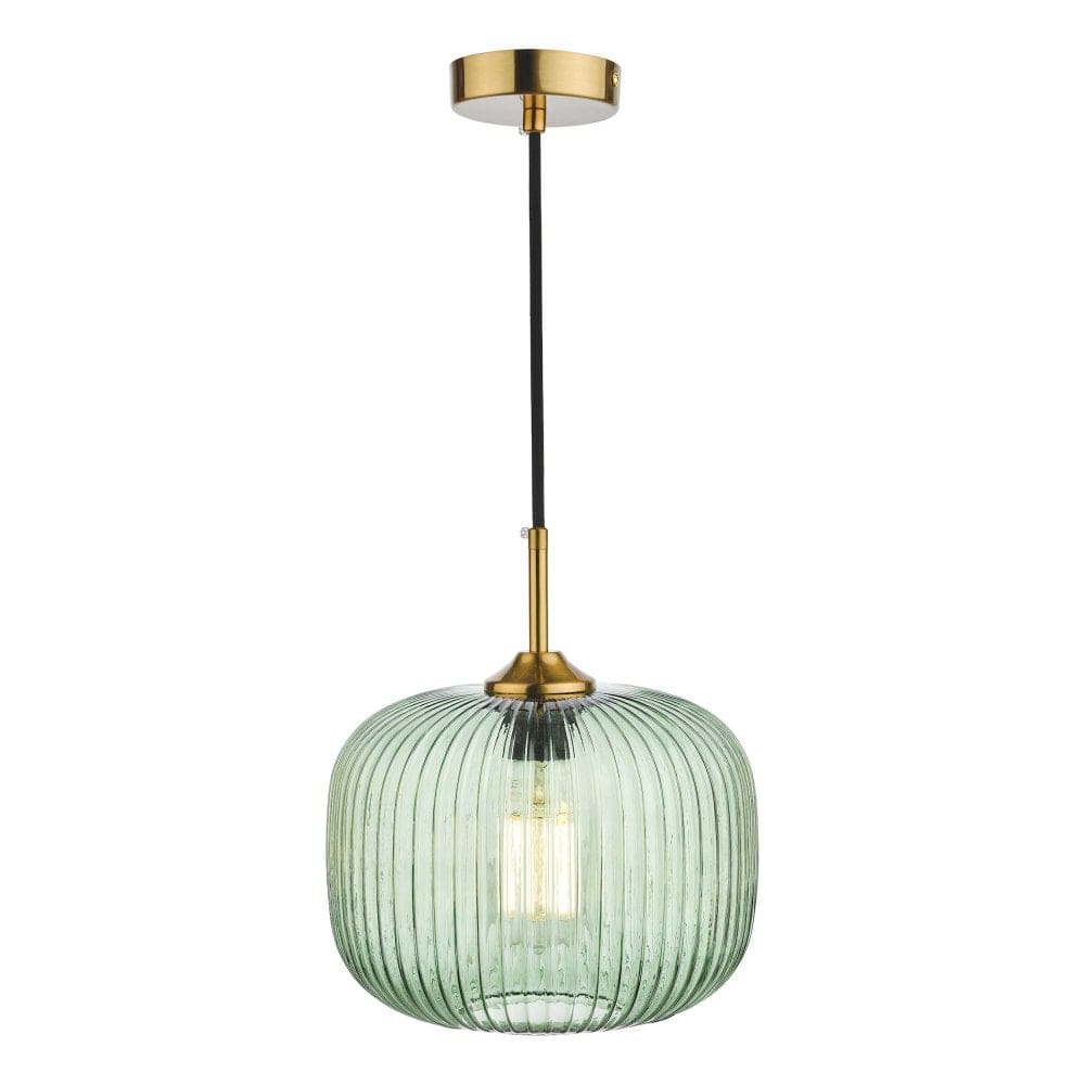
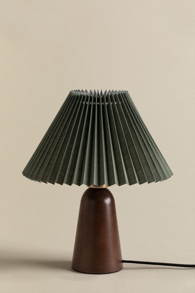
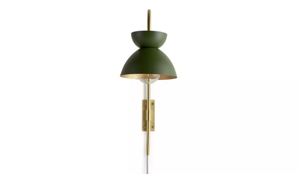
Image via Dar Lighting / Image via Sklum / Image via Habitat @ Argos
Soo many options out there however, one of our favs here at the T A L E S O F T E X T U R E Studio is Forest Green glass pendants and light shades. These add a pop of colour and diffuse the light beautifully within your space. However other materials work well such as velvet and painted steel. When paired with gold or brass details gives an opulent and luxurious finish. Or paired with dark wood tones for a grounded more natural finish.
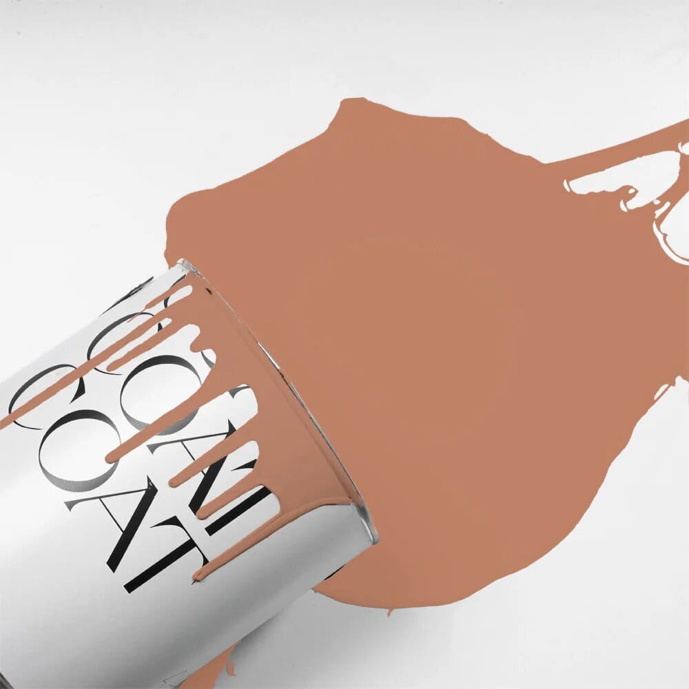
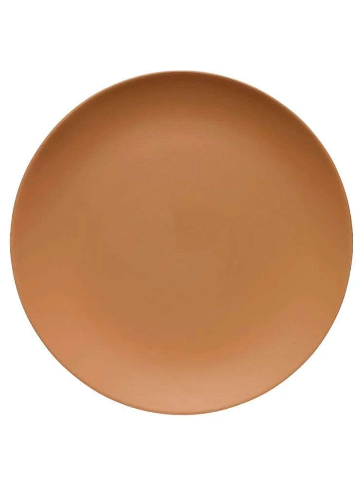
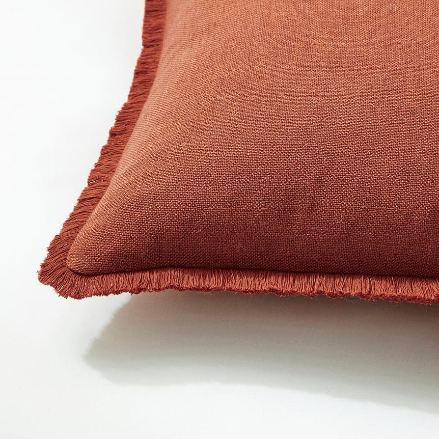
Tone No 2: Terracotta:
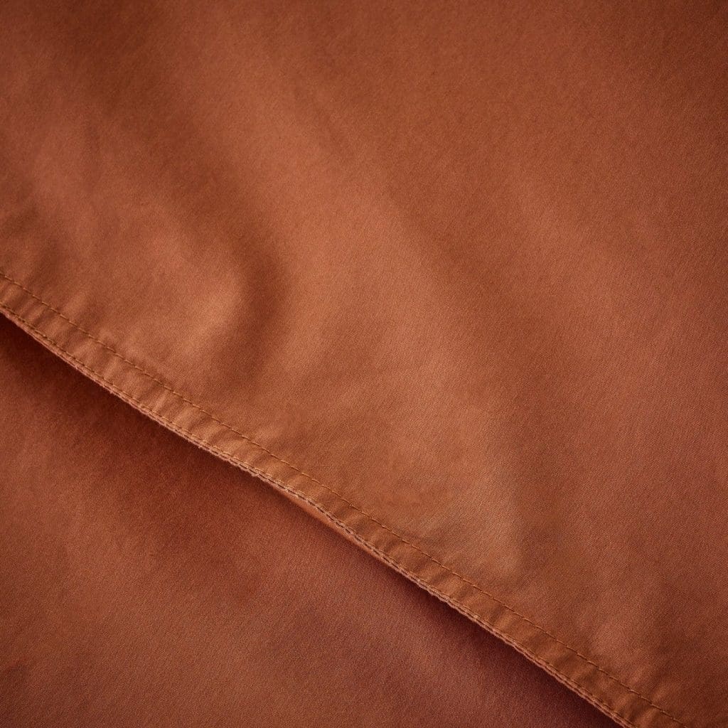
The origin of this warm and earthy tone dates back centuries. The word ‘Terra Cotta’ is of Italian and Latin origin and literally means ‘Baked Earth.’ Traditionally clay that is modelled for planters, sculptures and decorative artwork. When fired the iron oxide in the clay gives it its distinctive reddish-brown colour. However, the colour can vary greatly depending on the composition of the surrounding soil and land, with colours such as pinks, reds, browns, ochres and even a touch of black present. Centuries ago Terracotta was mixed with lime wash paint which provided one of the first paint colours used within interiors. Today we see this colour being used throughout our homes in the form of tiles, paints, fabrics, linens and home decor. And is an Autumn’s home dream colour to inject some warmth and comfort.
When used throughout our homes, Terracotta evokes feelings of security, groundedness and traditional values. It’s also said to have a relaxing and tranquillising effect within our homes. Offering a sense of balance and an appreciation of earthy, rustic natural beauty. Terracotta injects all-year-round earthy warmth and particularly offers an added richness throughout the Autumn months.
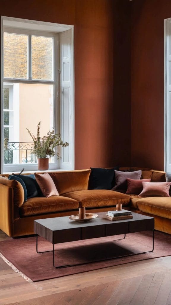
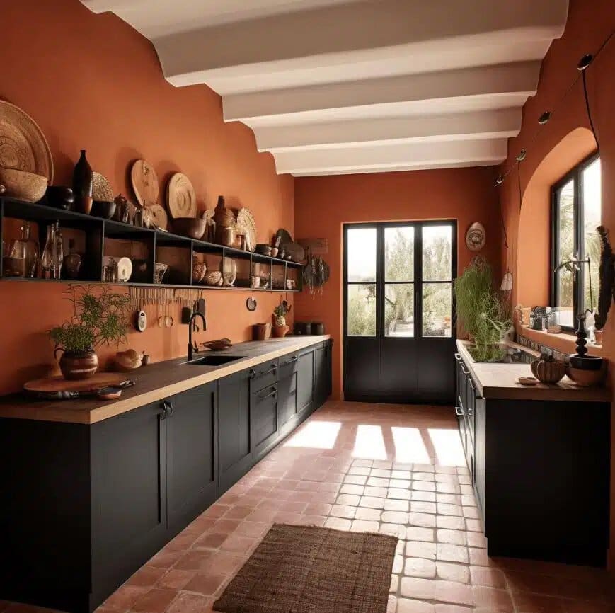
Image via Yes Colours / Image via Dusek Decor / Image via Bleu Canard
How to Implement Terracotta into Our Homes:
Terracotta is the perfect colour to implement into our homes for the Autumn season. It’s a Sustainable choice that offers longevity with its all-year-round warmth and serenity. Implementing the shade in a slightly darker tone for Autumn / Winter will add depth, warmth and cosiness.
Read More here about Sustainable Design and How to Achieve on Any Budget.https://talesoftexture.com/https-talesoftexture-com-sustainable-interior-design-post/
The Autumnal tone of terracotta can work within any space of your home depending on the application. It works especially well in North-facing spaces due to its warmth. So for instance, a nod to tradition with Terracotta tiling works beautifully in kitchens. When paired with warm wood-toned cabinetry and antique brass hardware. This conveys authenticity and offers a rustic, down-to-earth finish. However, Terracotta works equally as well with other natural materials. Such as marble, stone and polished concrete in a kitchen environment. And when accented with black adds a modern and contemporary twist. Consider implementing Terracotta tiles on your walls as a splashback or feature wall detail, on your floors for a traditional, rustic vibe or even on your countertops for a modern twist.
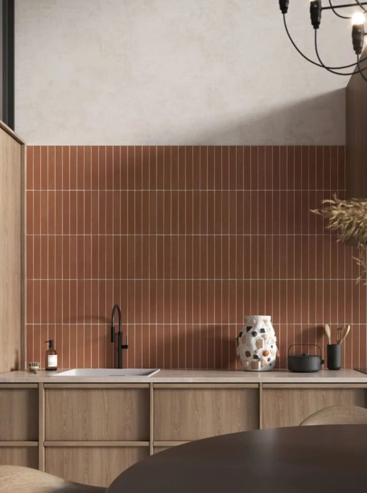
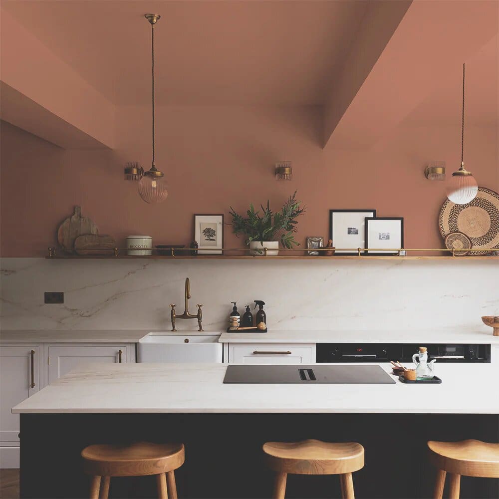
Image via Claybrook / Image via Coat Paints
If you want to fully embrace this truly warming tone for Autumn consider painting your bedroom with this comforting and calming hue. By colour-drenching your space you will create a cosy haven in which to relax, switch off and nod off with ease! This design technique simply means using the same colour throughout your space in abundance….. Everywhere the eye can see should be painted in the same shade. So think walls, ceiling, trim, woodwork, window frames, radiators and even furniture. This technique can actually make your space appear larger and lighter (depending on the depth of colour chosen!) As well as create a cozy cocoon of a space.
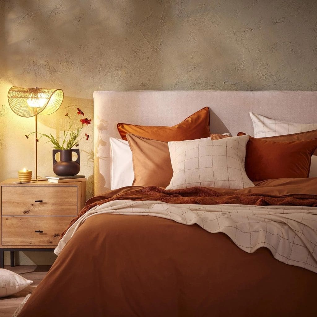
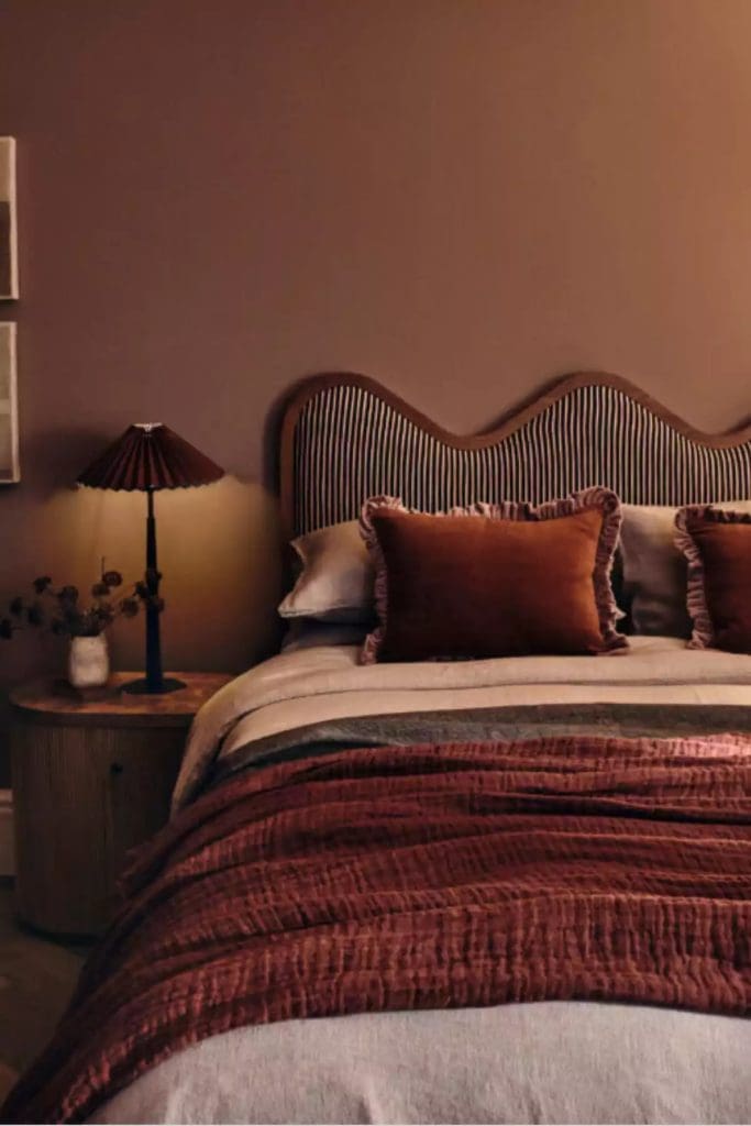
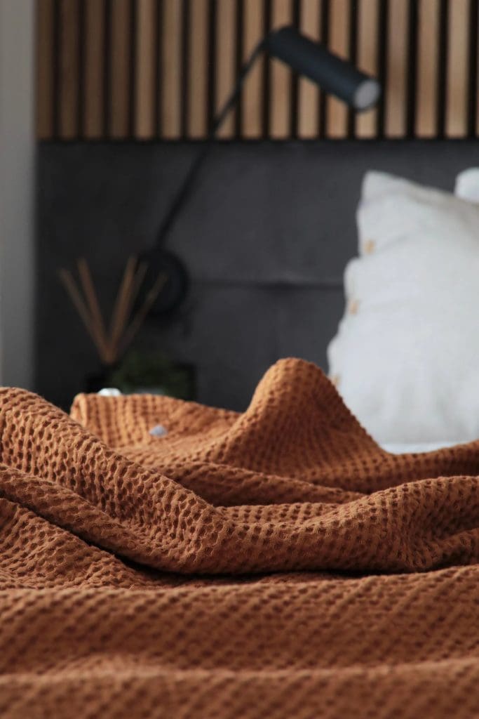
Image via Dusk / Image via Ben Anders @ Sheerluxe.com / Image via Etsy
If colour drenching is just a slight step too far for you then no worries at all, try tonal decorating instead. So pick your base shade of Terracotta and then accent with lighter or darker tones of this same colour. This creates visual interest as well as continuity for your space. Very much like tonal dressing everything ties in, working beautifully together and complimenting each other. This technique works especially well in a bedroom space. As there’s very little contrast so your eyes fall gently around the space. Taking it all in together and instantly feeling calm, relaxed and serene.
If you’re looking to simply accent your space with Terracotta then there are ample ways to achieve this within your home for Autumn / Winter. Because Terracotta is of natural origin it works beautifully as a neutral base. It can easily be paired with colours such as warm muted whites, pinks, reds, greens, mustards and even blues. So no matter your colour palette you can easily complement and pair these tones with Terracotta.
For an Autumnal pairing consider colours such as warm off-whites, mochas, caramels, chocolates and deep burgundy reds. Warm and darker-toned woods pair beautifully with Terracotta, especially for the Autumn / Winter season. Think dark oaks, mango wood and walnut tones. Other fabrics that pair well also include leather in warm soft tans and dark chocolatey browns. And luxurious velvets, faux fur in muted warm neutrals as well as chenille and chunky woven knitted fabrics also work stunningly. When accented with black this adds visual interest and contrast as well as depth and balance.
You can accent your space with a painted wall feature, curated artwork, bed linens and soft furnishings as well as table decor such as candles, bowls and fabrics. So with all this in mind let’s delve deep into where to shop these Terracotta hues…..
Terracotta Fall Home Decor Ideas and Where to Shop:
Paint:
If you are considering adding a hint of Terracotta to your home this Autumn / Fall season then paint is a great place to start! It’s a fully accessible and an inexpensive option. There are sooo many variations of this shade available. So you can be sure to find one that suits your space and taste.
Considerations when picking a paint colour should include the orientation of the room. North-facing spaces receive much less natural light than their South-facing counterparts and is a much cooler, blue light. So in this instance, you should choose a hue that has warm, reddish-brown undertones. For the cooler, darker seasons you can really amp up the drama and cosiness by going darker!
How much natural light does your space receive? This will affect the saturation levels of the colour and how it is viewed within the space as well. The type of paint you choose can also make or break a space. If using in a kitchen or bathroom ensure you have a mould and water-resistant paint that is easy to clean and won’t peel over time. Matt, eggshell and satin sheen emulsion works beautifully for walls, ceiling and trim detailing. And by using a limewash or textured paint not only are you going to achieve a stunning colour option. You will also have the added benefit of texture and tradition if this suits your style and space.
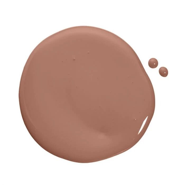
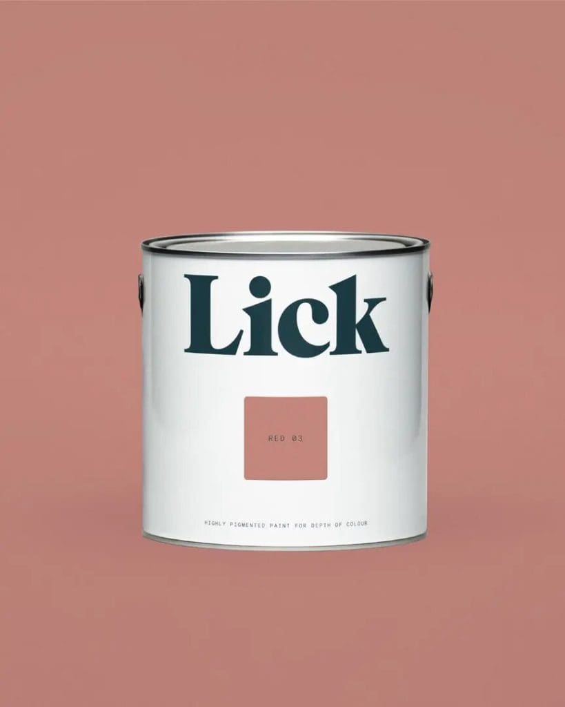
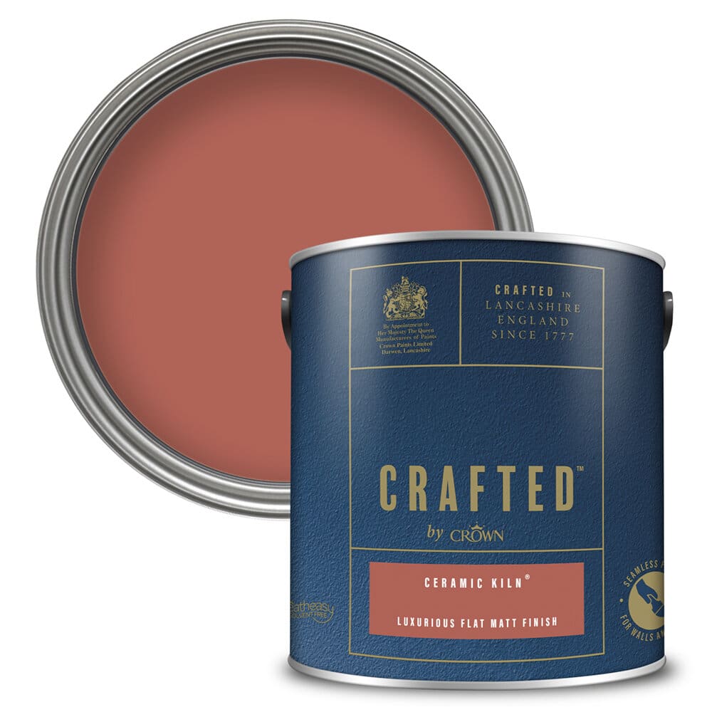
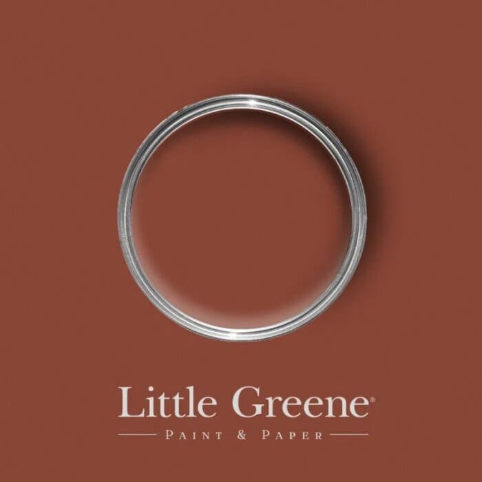
Images of ‘Baked Soft Terracotta’ by Coat / ‘Saffron Tan’ by Claybrook / ‘Canyon’ by Decorating Centre Online / ‘Red 03 Mat’ by Lick / ‘Ceramic Kiln’ by Crafted by Crown / ‘Tuscan Red’ by Little Greene
Wallpaper:
If you’re someone who loves pattern, and detail and wants to add visual interest why not add a wallpaper to your space? There are so many patterns to choose from. And so many brands and suppliers have ample options for every room of your home.
Here at the T A L E S O F T E X T U R E Studio, we love nature-inspired prints and textured papers. These style prints lend themselves perfectly when in a Terracotta tone. They beautifully reflect the element of nature and Sustainability, something we love and cherish here at the studio!
Implement wallpapers within a bedroom, lounge or dining space for a traditional application. Or a great contemporary use is to implement wallpaper as a splashback in your kitchen. Simply ensure this is suitable for high moisture areas and seal with a clear, wipeable surface over the top. This provides a practical finish alongside a modern, fun aesthetic.
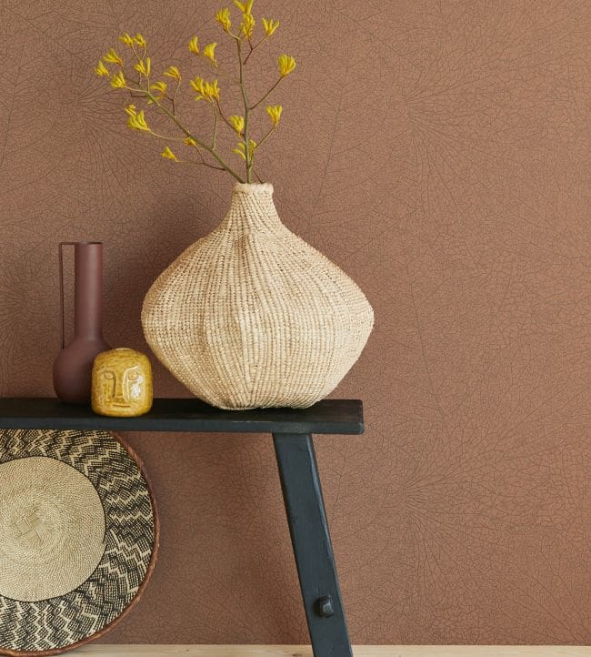
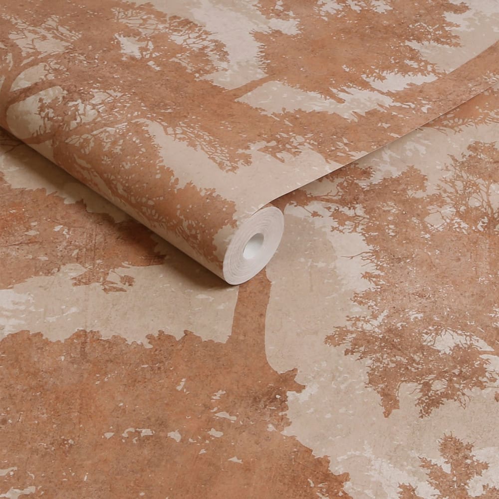
Images of ‘Leaf Vein Terracotta’ Wallpaper by Jane Clayton / ‘Trailing Trees’ Wallpaper by Next
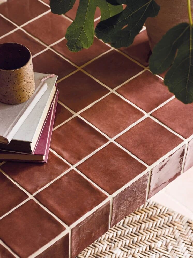
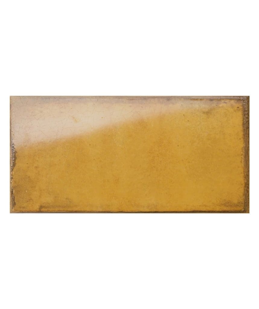
Tiles:
As previously mentioned Terracotta tiling has been around for centuries and offers a traditional and rustic finish. However there are now so many options of tiles available, and more contemporary styles have emerged offering a modern twist. Meaning these can work super well within a traditional or modern home.
They add texture and depth to your space as well as warmth. Consider using as flooring in hallways and communal areas, for your bathroom walls and shower area, kitchen splashbacks and countertops, and even as feature walls in your dining areas or mudrooms.
Bert & May, Porcelain Superstore, Fired Earth, Claybrook and The Baked Tile Company all offer a great range of Terracotta tiling including reclaimed options (we love a bit of recycling!!) Traditional shapes and styles alongside modern materials and finishes are available. So there really is something for everyone.
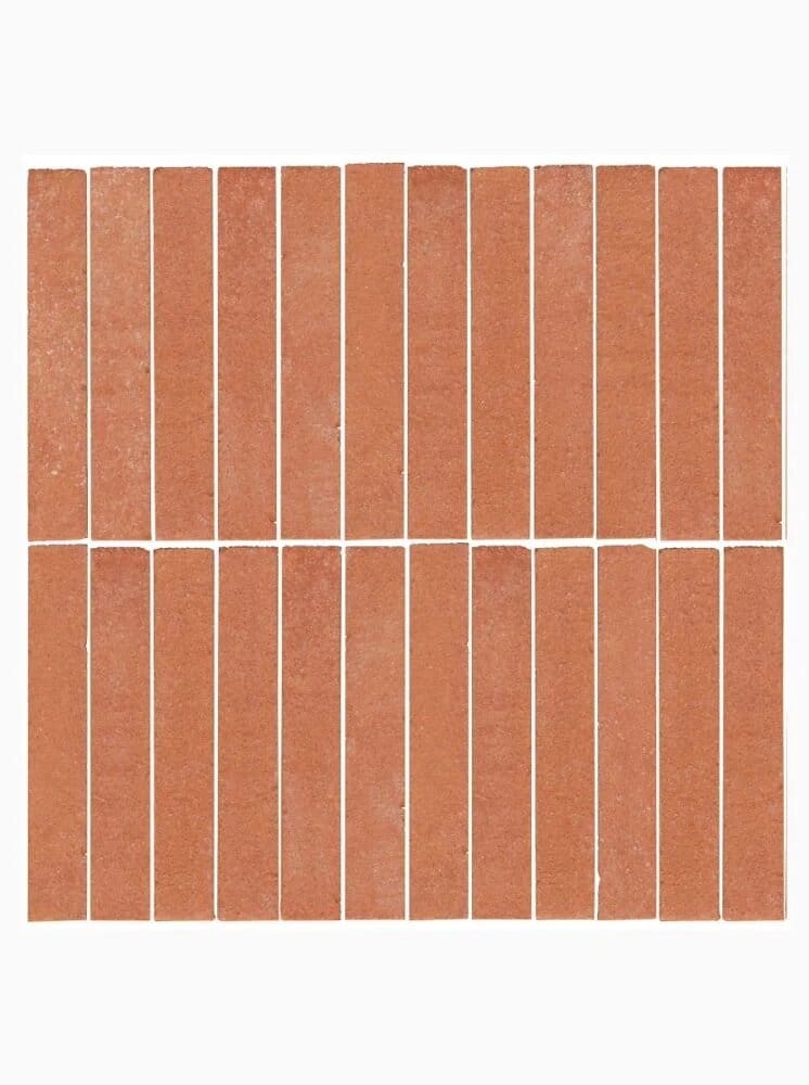
Images of ‘Georgetown Brick’ Tiles / ‘Ema Mosiac’ Tile / ‘Tan Tan Adobe’ Tile all by Claybrook
Lighting:
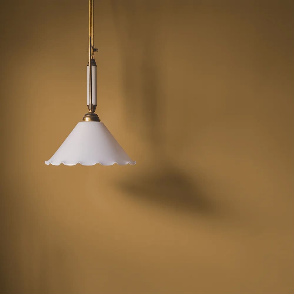
When thinking of implementing lighting your mind probably wouldn’t automatically jump to the option of Terracotta. However, we urge you to strongly consider it! Again there are so many options available here from the traditional urn-style table lamps to modern ceiling pendants. Either in the material of traditional clay or painted finishes in this warming hue. When introducing a warm-white, low-level globe the combination of both these colours and materials add so much cosiness and warming glow you’ll never want to turn the light off again!
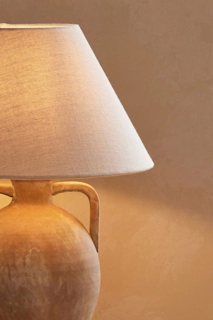
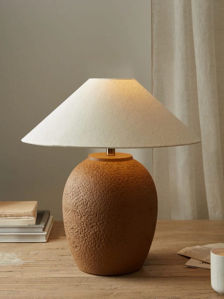
Images of ‘Charlford Table Lamp’ by Next / ‘Okai Style Ceiling Lamp’ by Sklum / ‘Oran Table Lamp’ by Layered Lounge
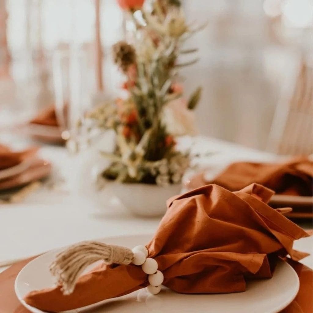
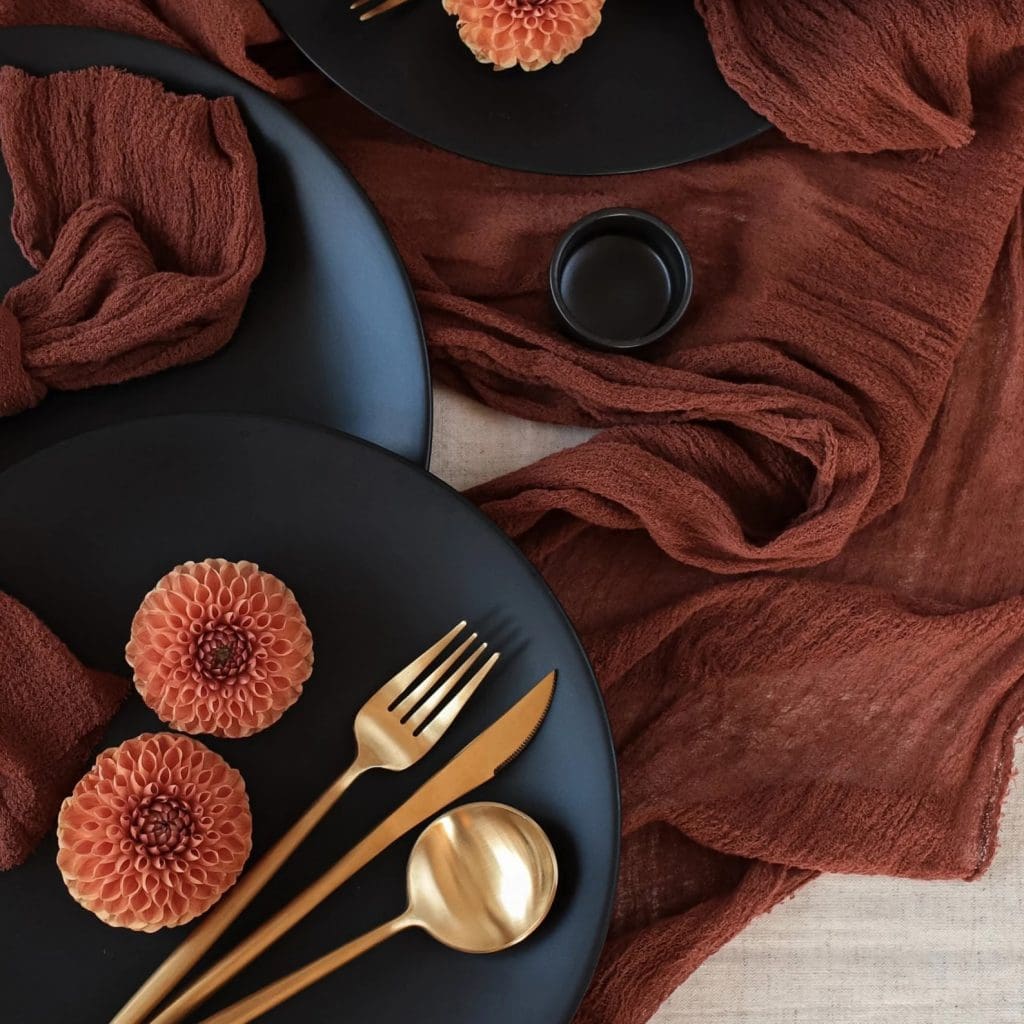
Fall Home Decor, Tableware and Accessories:
If you want to stick to a neutral base throughout your home and add accent pieces in Terracotta tones then linens, decor, tableware and accessories are your happy place! This is a great cost-effective and simple way to decorate for changing seasons. Now that the darker, cooler months are upon us we can inject some deep, rich tones of Terracotta to add warmth. Then when we roll around to Spring / Summer time simply swap out these pieces. Lighter hues and summery fabrics will create an urban, sun-baked vibe.
Within the bedroom add bed linens, throws and cushions in varying tones. With a sumptuous look and feel, you’ll be super snug and cosy, and never want to leave! These can also be added to sofas and snuggle seats in the lounge. To create the same atmosphere and add a hint of natural warmth.
When adding terracotta tones to your tableware pair them with ribbed glassware, and natural materials such as jute and bamboo. Or to add drama and depth pair them with black and gold accents. Seasonal foliage such as berries, and leafy stems in complimentary oranges, reds and browns offer height, movement and a softness to your table scape. And candles offer low-level, mood lighting.
Earthenware, vases, and ceramics are a beautiful textured way to implement Terracotta into our home styling. With a nod to tradition but in modern, organic forms these decor pieces offer a blend of traditional and contemporary style.
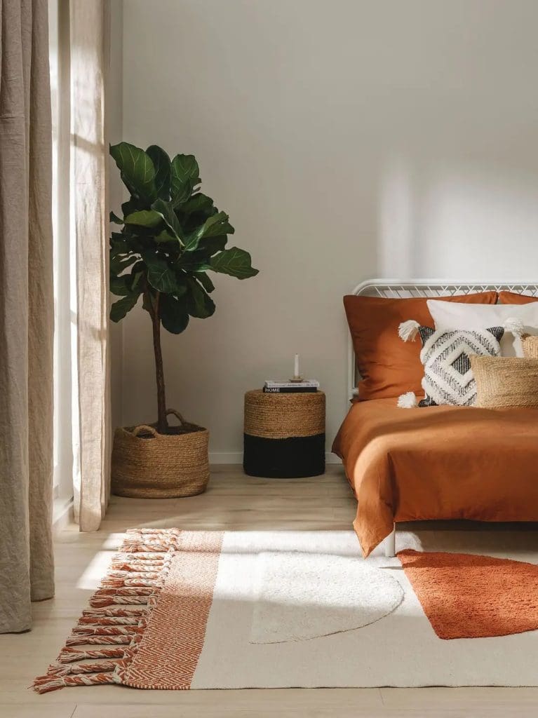
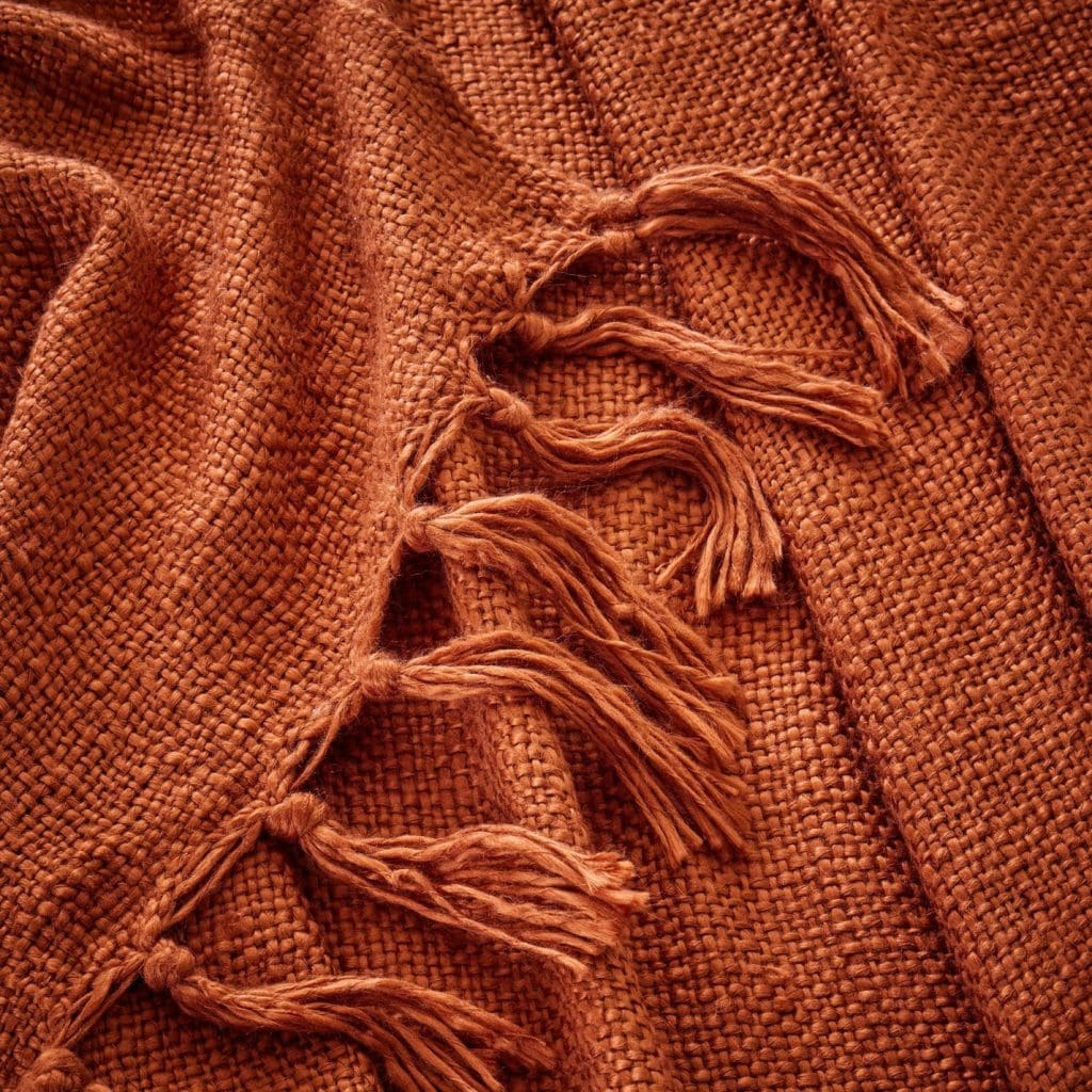
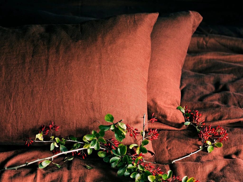
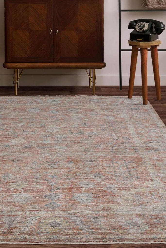
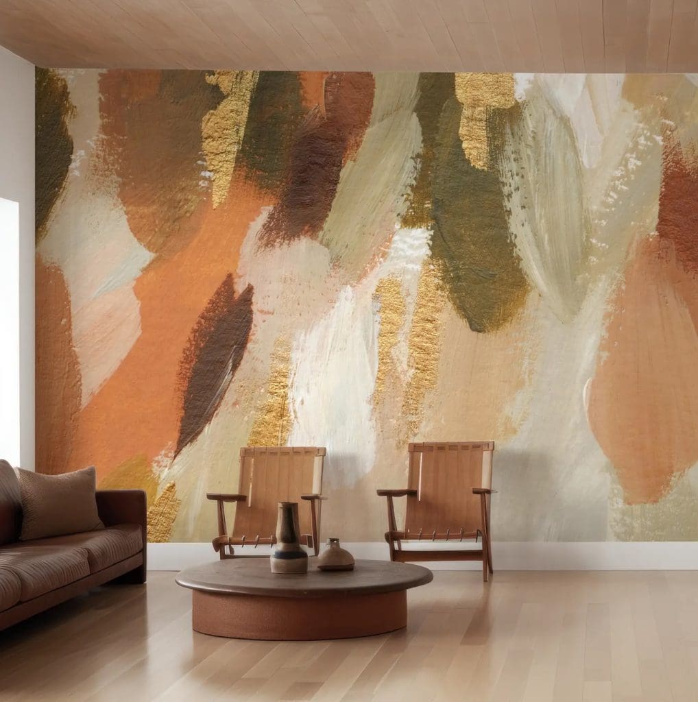
Images of ‘Pop Orange’ Rug by Benuta / ‘Boucle Throw in Burnt Orange’ by Dusk / ‘Rustic Cloth Napkin’ via Etsy / ‘Terracotta Cheesecloth Table Runner’ via Etsy / ‘Terracotta Linen Duvet Set’ via Etsy / ‘Asiatic Rug’ by Next / ‘Tufted Cushion in Burnt Orange’ by Dusk / ‘Wall Mural Terracotta’ by Wallism / ‘Cinnamon Washed Cotton Duvet Set’ by La Redoute
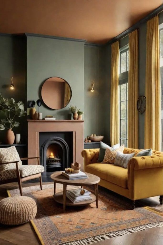
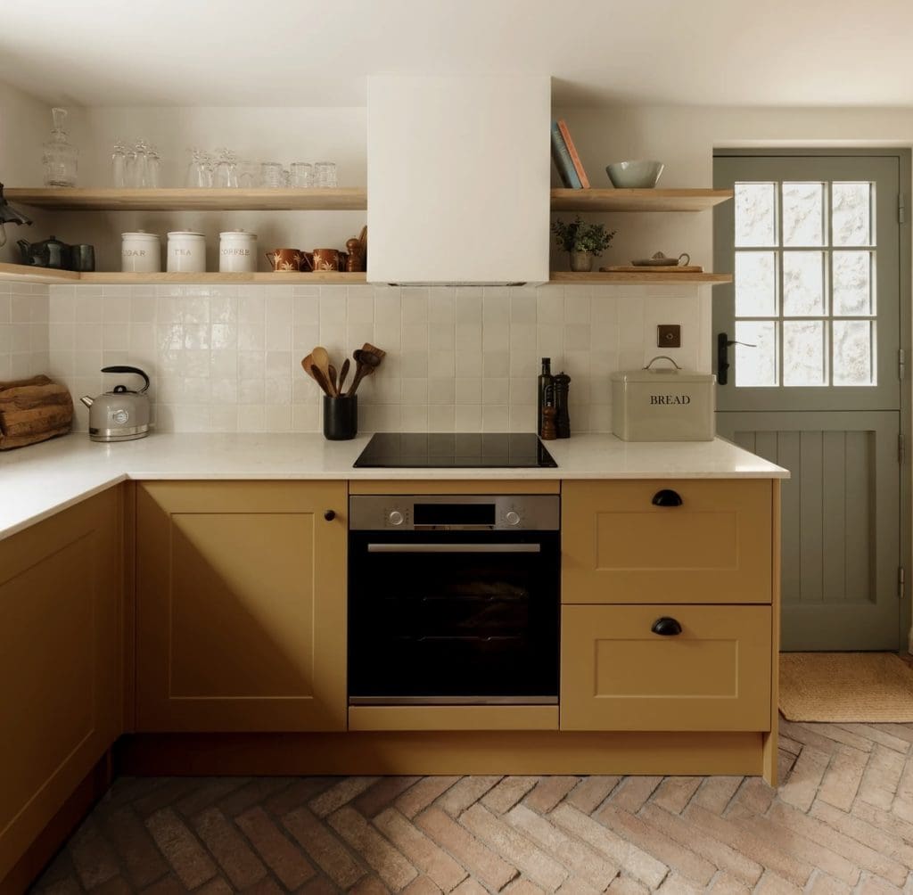
Tone No 3: Yellow Ochre:
Again Yellow Ochre has been around for centuries. It is one of the oldest tints used when originally mixed with clay and colourful minerals, for interior and exterior walls. Warm and earthy with an ancient feel, commonly used in African and Aboriginal art. It is also what you’ll see around Tuscany Italy. The small, rustic yet elegant villages and towns are painted throughout in this ancient hue.
It became hugely popular during the Mid-Century Modern era from the 1930s to the 1970s. Characterized by clean lines, functional design as well as favourited materials of wood, metal, bent plywood, steel and plastic laminates. A true balance between natural and synthetic materials. Yellow Ochre enjoyed a boom during this period. And nowadays has become a staple colour to use throughout our homes, with Mid-Century design still very popular and current today. Often teamed with dark greens, burnt oranges and burgundy reds. This shade of yellow can be light and golden in tone or warm, dark and rich brown in tone, which works beautifully for the Autumn / Fall season.
This delightful yellow hue works particularly well as an accent colour throughout our homes. It’s a hugely versatile colour that pairs well with every colour on the spectrum! Particularly every shade of blue, other jewel tones such as teals, as well as soft, blush pinks for a more relaxed vibe. If you’re a Dopamine Design fan then this is the colour to inject. It works with sooo many others and really gives a hit of sunshine and joy!
Yellows evoke feelings of optimism and positive energy. Ochre’s earthy tones also evoke a sense of warmth, comfort and stability allowing us to feel nurtured and grounded. And is also said to stimulate appetite so therefore works beautifully in kitchens and dining spaces.
To create a grounding and warming interior using Yellow Ochre for the Autumn / Winter season add soft creams, warm taupes and enticing caramels and mochas. Warm wood tones pair stunningly well with Yellow Ochre in a kitchen environment. Accent with brass or aged gold hardware for a hint of laidback luxury. If darker-toned woods are your preferred go-to then no problem. This also compliments Yellow Ochre beautifully adding some depth and tonal difference, and when accented with dark chocolatey browns and warm neutrals a contrasting yet flattering space is created.
Images via Pinterest
How to Implement Yellow Ochre into Our Homes:
As mentioned above the Autumnal tone of Yellow Ochre works stunningly well as an accent colour. Our homes nowadays have to perform well within many functions. So therefore have to be versatile and offer flexibility of use. Yellow Ochre is the perfect colour to achieve this flexibility as it’s very often viewed as androgynous. It can be injected throughout our homes in pretty much every space. Offering those multi-functional areas a great uplifting and joyous backdrop.
When paired with light greys a classic palette is created. Whilst pairing with warm off-whites and bright whites a more modern aesthetic is achieved. For an organic feel to your home add warm soft neutrals along with natural materials such as sheepskins, rustic woods, light tan leathers and aged brass.
Image via Jalan Interior
Yellow Ochre Fall Home Decor Ideas and Where to Shop:
Paint:
To achieve a depth of colour and a warm Autumnal glow, go for shades that are darker in tone with golden brown undertones. These keep your space feeling more muted and organic. As well as lending themselves well to accent with other natural and organic colours such as dark green and terracotta. Creating a home that feels nurturing and comforting for those long, colder months.
Little Greene has a beautiful collection of Yellow Ochres’ to suit every taste, with fantastic colour saturation and coverage. Simply consider the amount of natural light within your space. As well as how bright and cheery you’d like to go!
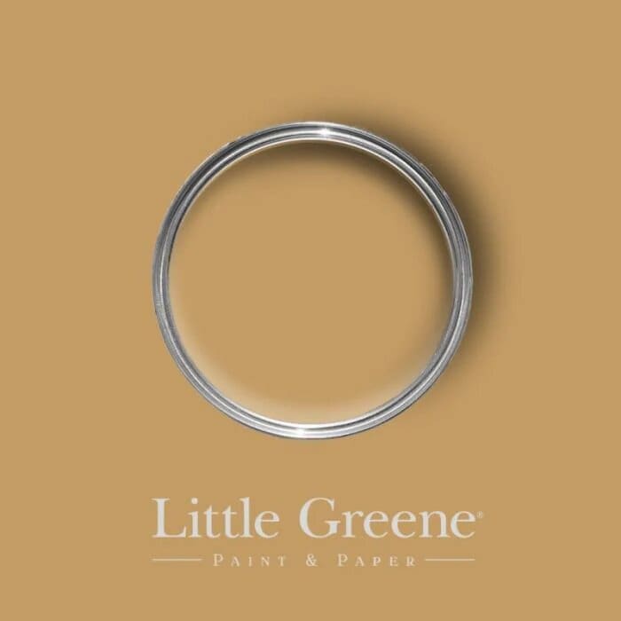
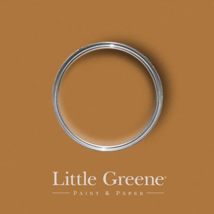
Images of ‘Bombolone’ / ‘Middle Buff’ / ‘Galette’ / ‘Yellow Pink’ Paints all by Little Greene
Other paint suppliers including Johnstones, Dulux, Dunelm Paints and Fired Earth, all have great options available to suit any budget.
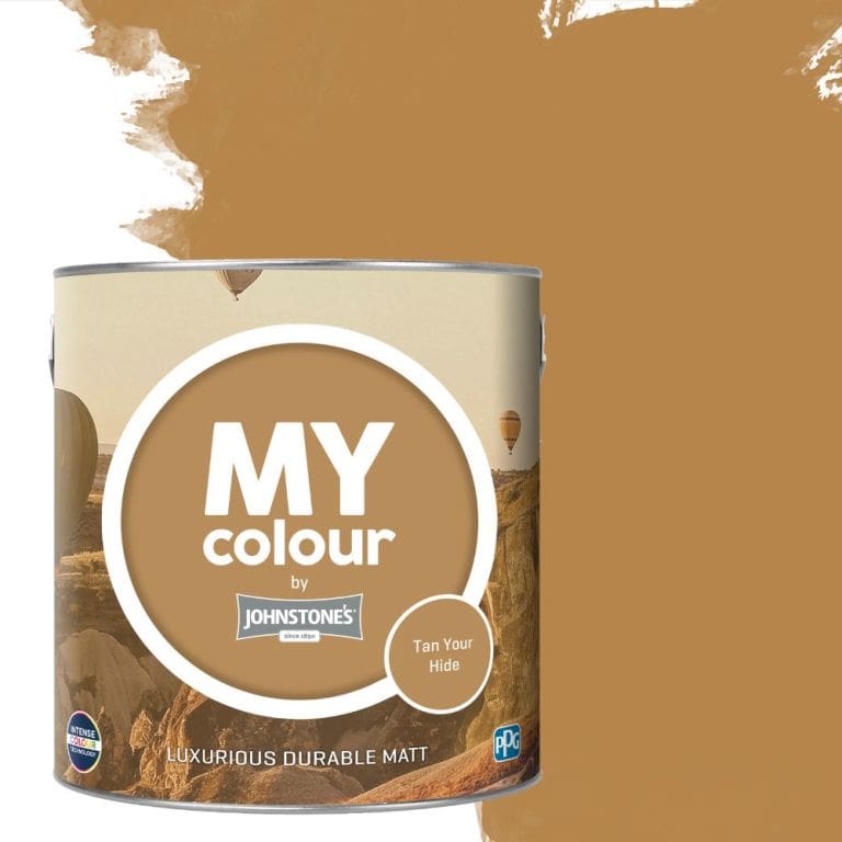

Images of ‘Tan Your Hide’ Paint by Johnstones / ‘Hoppers Hat’ Paint by Fired Earth / ‘Miles From Monday’ Paint by Coat
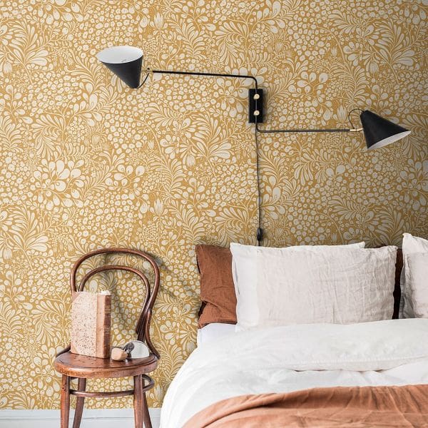
Wall Coverings:
Yellow Ochre also lends itself well to wallpapers and tiling options. These can add depth and texture as well as pattern, visual interest and a pop of colour.
A little like the Terracotta options. Wallpaper prints that are nature-inspired, with a historical reference work extremely well in Yellow Ochre. Think William Morris floral patterns and foliage.
Tilling in Yellow Ochre can add an element of fun as well as functionality. Use in the kitchen for a pop of colour that will cheer you up as you cook! Within a bathroom space use accent tiles as a border, or a panel section in the shower area to again inject that fun and vibrant finish.
Images of ‘Catania Ochre Tile’ @ Topps Tiles / ‘Sommarang’ Wallpaper @ World of Wallpaper
Furniture:
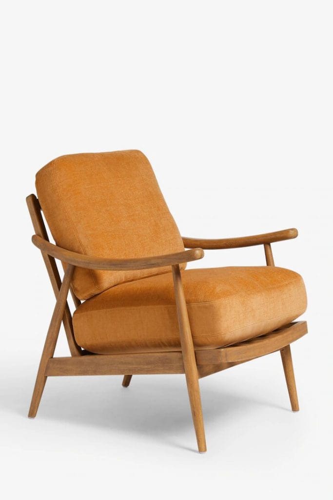
Furniture pieces in Yellow Ochre are more often than not in the style of Mid-Century Modern pieces. These can work incredibly well in a modern home with their clean lines, wooden detail and upholstered Yellow Ochre finish. Popular pieces to implement in your home include sofas, armchairs, dining chairs and footstools. Accent these with warm neutral cushions and throws. As well as a lightly patterned rug in warm taupes and chocolatey browns. Achieving a cosy and welcoming space that feels grounded and inviting.
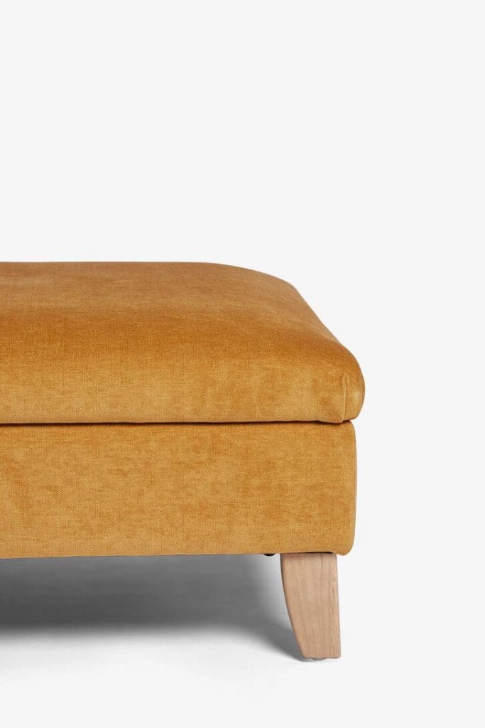
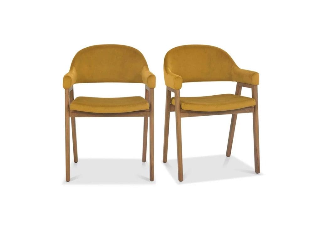
Images of ‘Albury Footstool’ by Next / ‘Ochre Yellow Side Table’ by Barker & Stonehouse / ‘Wooden Hampton Chair’ by Next / ‘Stratford Dining Chairs’ by Furniture Village
Fall Home Decor and Accessories:
Fall decor in Yellow Ochre is incredibly appealing and versatile, as well as super simple to implement for the Autumn season. Many of these pieces will see you through year-round, making them a practical and sustainable option as well.
Some of our favs here at the T A L E S O F T E X T U R E Studio include styling items such as vases, ceramics, dried stems, and foliage (absolutely gorgeous this time of year to add pops of colour and last all year through!!) As well as warming candles and candle holders.
Yellow Ochre is also a beautiful choice for soft furnishings, bed linens, and upholstery. When implemented in plush warm velvets, or natural organic linens these feel luxurious and yet grounding in this glorious hue.
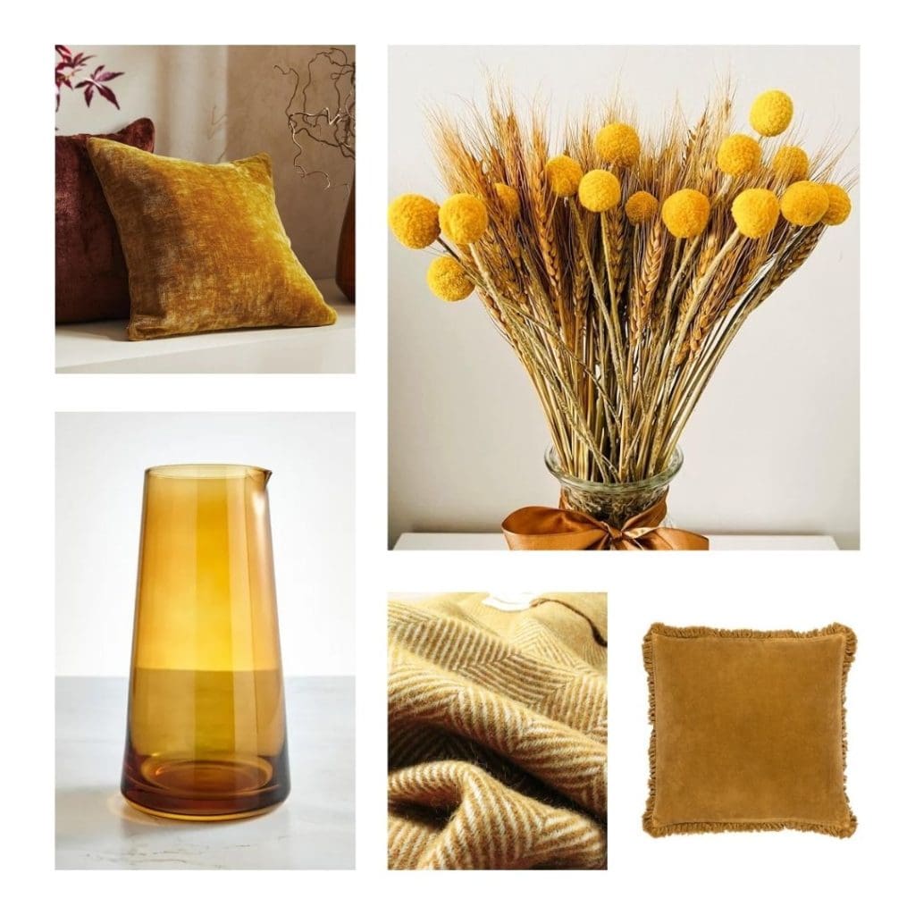
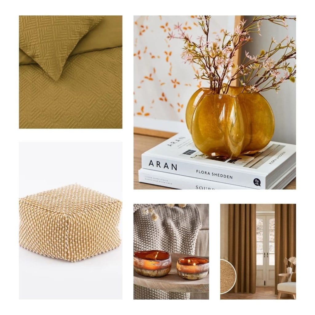
Images of ‘Camilla Chenille Cushion’ by Next / ‘Dried Wheat and Yellow Flowers’ @ Amazon Home / ‘Ochre Embossed Duvet Set’ by Asda / ‘Tealight Candle Holder / Vase’ by Rose and Grey / ‘Amber Glass Carafe’ by Dunelm / ‘Gold Ochre Herringbone Wool Throw’ @ Not on the High Street / ‘Yard Saffron Bertie Cushion’ by Next / ‘Jersey Bobble Pouffe’ by Dunelm / ‘Janka Glass Tealight Holders’ by Nkuku / ‘Dark Gold Cosy Curtain’ by Next
To Wrap Up…..
To warm up your space for the coming Autumn and Winter seasons consider adding Forest Green, Terracotta, or Yellow Ochre. Each of these colours is hugely popular this season. However, also all have been used traditionally throughout history and offer longevity and flexibility of choice in your home. By implementing darker, grounded tones this season you will create a home that feels nurturing, comforting and welcoming. And by adding in accents, decor, and accessories this aesthetic can be easily achieved on any budget and easily updated for the changing seasons. Have fun with your space and make it your own by implementing one or all three of these hues!
Have a great rest of the week and enjoy getting super snuggled and cosy!